Stock Market Charts & Technical Analysis
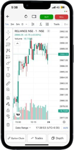
Track live charts for stocks, indices, and F&O instruments. Analyze price movements, identify trends, and make informed trading and investment decisions using interactive charts and technical analysis tools.
How To Read Stock Charts

Identify Trends
Recognize uptrends, downtrends, and sideways movements

Support & Resistance
Find key price levels where stocks tend to reverse

Volume Analysis
Confirm trends by analyzing trading volume patterns

Candlestick Pattern
Learn bullish and bearish reversal patterns

Moving Averages
Use MAs to smooth out price data and spot trends

RSI Indicators
Measure momentum to identify overbought/oversold conditions
FAQ's
What are stock market charts?
Stock market charts are graphical representations of a stock's price movement over a specific period. They display important market data such as opening price, closing price, highest price, lowest price, and trading volume. Investors and traders use these charts to identify trends, price patterns, and potential buying or selling opportunities. Charts can be viewed over different timeframes, ranging from a single minute to several years, depending on your investment horizon. Whether you are analysing equities, indices, futures, options, or other financial instruments, stock market charts help simplify complex market data and make it easier to understand price behaviour and market sentiment before making investment decisions.
Why are stock market charts important for traders and investors?
Stock market charts help traders and investors analyse historical price movements and understand market trends before making investment decisions. They make it easier to identify momentum, support and resistance levels, volatility, and potential trend reversals. Short-term traders often rely on charts to determine entry and exit points, while long-term investors use them to understand broader price trends and market cycles. Charts also complement fundamental analysis by providing insights into market sentiment and price action. Instead of relying solely on news or emotions, investors can make more informed decisions using visual data backed by historical market performance.
How do I read a stock market chart?
Reading a stock market chart starts with understanding the price displayed on the vertical axis and time shown on the horizontal axis. Depending on the chart type, each bar, line, or candlestick represents price movement during a selected timeframe. Investors should observe the overall trend, identify support and resistance levels, analyse trading volume, and look for common chart patterns. Technical indicators like moving averages, RSI, or MACD can provide additional insights. Beginners should start with daily charts to understand broader price movements before exploring shorter timeframes used for active trading.
What are the different types of stock market charts?
Several types of charts are used in stock market analysis, each serving different purposes. Line charts connect closing prices and are ideal for identifying long-term trends. Bar charts display the opening, high, low, and closing prices for each trading session. Candlestick charts present the same information visually, making it easier to identify market sentiment and reversal patterns. Other specialised charts, such as Heikin Ashi, Renko, Point & Figure, and Area charts, are also used by experienced traders for specific trading strategies. The choice of chart depends on an investor's experience, objectives, and trading style.
What is technical analysis?
Technical analysis is the process of evaluating securities by analysing historical price movements, trading volume, and chart patterns rather than a company's financial statements. The underlying principle is that market prices often reflect all available information, and historical price behaviour can provide clues about future movements. Traders use technical analysis to identify trends, momentum, support and resistance levels, and potential reversal points. It involves studying charts alongside technical indicators such as moving averages, RSI, MACD, Bollinger Bands, and Fibonacci retracements. Technical analysis is commonly used for equities, derivatives, commodities, currencies, and indices.
What is the difference between technical analysis and fundamental analysis?
Technical analysis focuses on price movements, trading volume, and market trends to predict future price behaviour. Fundamental analysis, on the other hand, evaluates a company's intrinsic value by studying financial statements, earnings, business model, management quality, industry position, and economic factors. Technical analysts primarily answer the question of when to buy or sell, while fundamental analysts determine what to invest in based on long-term value. Many investors combine both approaches by selecting fundamentally strong companies and using technical analysis to identify favourable entry and exit points.
What is a candlestick chart and how does it work?
A candlestick chart is one of the most widely used chart types in technical analysis because it provides detailed information about price movement during a specific period. Each candlestick displays the opening, closing, highest, and lowest prices. The body represents the difference between the opening and closing prices, while the upper and lower shadows indicate the day's price range. Bullish candlesticks generally indicate buying strength, while bearish candlesticks suggest selling pressure. Traders also analyse candlestick patterns such as Doji, Hammer, Engulfing, and Morning Star to identify possible trend reversals or continuation patterns.
What are trends, support, and resistance levels?
A trend represents the overall direction of a stock's price movement. An uptrend consists of higher highs and higher lows, while a downtrend forms lower highs and lower lows. Support is a price level where buying interest tends to prevent further declines, whereas resistance is a level where selling pressure often limits price increases. These levels help traders identify potential entry, exit, and stop-loss points. Although support and resistance are not guaranteed, they are widely used in technical analysis because they reflect areas where market participants have historically shown strong buying or selling interest.
What are chart timeframes, and which timeframe should I use?
Chart timeframes determine the period represented by each data point on a stock chart. Common timeframes include 1-minute, 5-minute, 15-minute, hourly, daily, weekly, and monthly charts. Intraday traders usually prefer shorter timeframes to capture quick price movements, while swing traders often use daily charts to identify medium-term trends. Long-term investors typically rely on weekly or monthly charts to understand broader market direction. There is no single best timeframe; the right choice depends on your investment objective, trading strategy, and holding period. Many experienced traders analyse multiple timeframes together for better decision-making.
What is the difference between stock charts, index charts, and F&O charts?
Stock charts display the price movement of individual companies listed on stock exchanges. Index charts track the performance of market indices such as the Nifty 50 or Sensex, providing insights into overall market trends. Futures and Options (F&O) charts represent derivative contracts, which derive their value from an underlying asset like a stock or an index. While stock and index charts primarily reflect cash market activity, F&O charts help traders analyse leverage, volatility, and derivatives-based trading opportunities. Understanding these differences helps investors select the right chart based on the instrument they wish to analyse.
Which chart is best for trading and technical analysis?
Candlestick charts are generally considered the most effective charts for trading and technical analysis because they provide detailed price information while making market sentiment easy to interpret. They clearly show opening, closing, high, and low prices and support the identification of popular chart patterns. Line charts are useful for understanding long-term trends, while bar charts provide similar information in a different visual format. Ultimately, no single chart is universally best. Most traders prefer candlestick charts because they work well with technical indicators and are widely used across equity, derivatives, commodities, and currency markets.
What technical indicators can be used with stock charts?
Technical indicators are mathematical calculations based on price, volume, or open interest that help traders analyse market trends and momentum. Popular indicators include Moving Averages, Relative Strength Index (RSI), Moving Average Convergence Divergence (MACD), Bollinger Bands, Stochastic Oscillator, Average True Range (ATR), and Fibonacci Retracement levels. Each indicator serves a different purpose, such as identifying trends, measuring momentum, detecting volatility, or spotting potential reversal points. Most traders combine multiple indicators instead of relying on just one, as using complementary signals can improve the quality of technical analysis and trading decisions.
Can beginners use stock market charts effectively?
Yes. Beginners can learn to use stock market charts by first understanding basic concepts such as price trends, support and resistance, trading volume, and simple chart patterns. Starting with line charts or candlestick charts on daily timeframes can make the learning process easier. Rather than memorising numerous technical indicators, beginners should focus on interpreting price action and understanding market behaviour. Over time, they can gradually incorporate advanced indicators and multi-timeframe analysis. Regular practice and disciplined observation help improve chart-reading skills and build confidence in analysing different market conditions.
Are stock market charts useful for long-term investing?
Yes. Although stock market charts are widely associated with short-term trading, they are equally useful for long-term investors. Weekly and monthly charts help identify long-term trends, major support and resistance levels, market cycles, and periods of accumulation or correction. Investors can use charts to determine better entry points, monitor portfolio performance, and avoid investing during extended periods of excessive market optimism or pessimism. When combined with fundamental analysis, stock charts provide a more comprehensive understanding of both a company's long-term potential and prevailing market sentiment.
Does Motilal Oswal provide live market charts for different asset classes?
Yes. Motilal Oswal offers interactive market charts across multiple asset classes to help investors and traders analyse market movements effectively. Users can access charts for equities, indices, Futures & Options, US stocks, mutual funds, bonds, IPOs, fixed deposits, PMS, AIFs, and other investment products available on the platform. These charts support technical analysis through multiple timeframes and commonly used chart formats, helping users monitor price movements, compare securities, and make informed investment decisions from a single platform.